This post is a practical guide to help you understand how to read topographic maps. I’m also going to discuss how to use them both at home and in the field. The United States Geological Survey (USGS) has created a vast archive of topographic maps over the last 125 years or so, covering most of the entire US. These topo maps (pronounced toe-po, not top-o) are also called quadrangles or quad sheets.
Topographic map legend
Were going to be working here with USGS quad sheets. Paper or digital, these are the basics.
The first information you need to look at on a topo map is in the bottom border of the map at the center underneath where it says “scale”
Contour Interval
Notice above where it says “CONTOUR INTERVAL 20 FEET” That is the vertical difference in elevation between contours. Different maps may have different contour intervals, and may even be shown in meters. It depends on the age and/or the series of the map. Always check contour interval first.
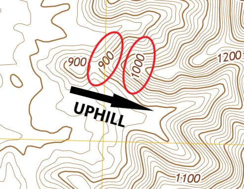
Next orient yourself on the map so that you know which direction uphill and downhill are. Notice above where I’ve circled the 900 and 1000ft elevations, indicating 100 feet of elevation difference between the heavier brown contours, which are known as index contours.
Note that between contour elevation 900 and 1000 above there are four lighter brown contour lines, each 20 feet higher as you move uphill, so, from index contour 900 the ground slopes up to 920, 940, 960 and 980 and another 20 feet to index contour 1000.

Using contours to read the terrain
On the topo map above I’ve highlighted some of the steepest terrain. At the top I circled index contours 1200 and 1300, indicating 100 feet of vertical elevation difference in a short horizontal distance. In other words the closer together the contours are, the steeper the slope is.
Also on the above map at the bottom right I’ve drawn arrows between contours 900 and 1000, again 100 feet of elevation difference, but over a much farther distance, indicating a less steep, or flatter slope. In other words, the farther apart the contours are, the flatter the slope is.

Ridges and valleys
On the map above where it says VALLEY, I’ve highlighted the 1000 foot contour elevation. Notice that the contour bows to the right as we look upslope in the direction of the arrow. We can also see that the land slopes up to the left and right of the tip of the arrow, approximately 80 feet up to contour 1000. The feature shown by the contours is a valley, or more accurately a draw, that ends in a steep slope up to the ridge top at about elevation 1600.
Also above, where it says RIDGE, as we look downslope in the direction of the arrows, the contours bow out to the left and we can see that to the left and right side of the arrows, the land slopes down, indicating a ridge line. The arrows are actually drawn along the very top of the ridge.
If I wanted to hike to the top of this range of hills, I would choose the ridge route, as it appears to be easier going, although it becomes quite steep as you near the top.
The last feature I show above is to the right of the map. Notice at the tip of the arrows I have highlighted the 1000 foot contour elevation. I’ve also highlighted the next lowest contour, which in this case is elevation 980. This shows us a 20 foot drop down to the dotted blue line. The blue line with three blue dots indicates a seasonal watercourse.
In this case we are in the Mojave desert, so the only times there would be water in this dry wash would be under flash flood conditions.
One more fact here about contours is that the more irregular or jagged the contours are, the rougher and rockier the terrain will be. The smoother and more uniform the contour intervals are indicates a smoother less rugged terrain.

Topographic map features
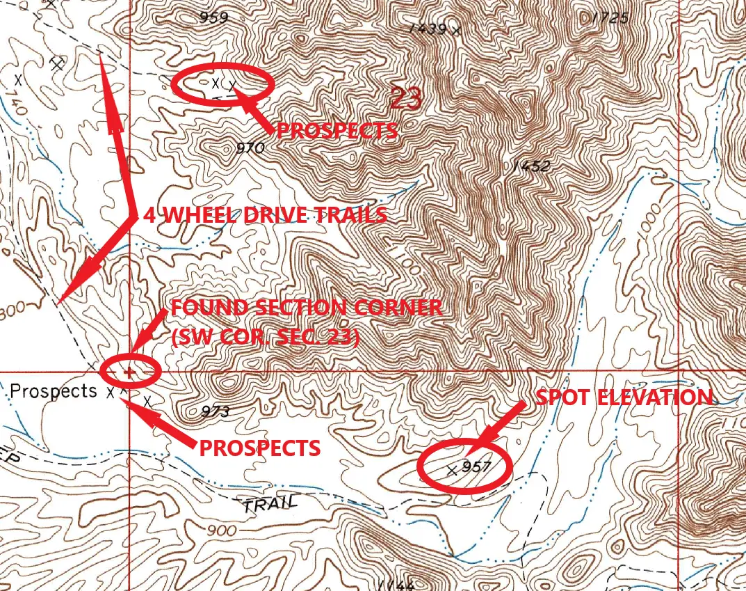
On the above topo map there are four features shown other than contours. 4 wheel drive trails which are shown as a dashed gray line, secondary roads shown as a solid gray line, the light blue line that is broken with three dots, which indicates a seasonal watercourse as discussed above.
The fourth feature is the straight yellow grid lines that run in approximate cardinal directions, north, south, east and west across the map. This is the UTM grid and each grid length is equal to 1000 meters. This is useful for measuring rough distances, although I usually convert meters to feet by multiplying by 3.3, especially if I need to calculate approximate grades or percent of slope.
USGS Topographic map symbols here
Use the link above for a four page legend showing every symbol and definition used by the USGS on their topographic maps.
Historical USGS Topographic Maps
Up until now we have been working with a newer US Topo map from the USGS.
Now we will take a look at the same general area on an historical USGS topo from 1971.
The contour interval and map scale on both maps are the same. But notice on the 1971 topo above how much more detailed the contours are. Also notice the features that are missing on the newer US Topo. Additional 4 wheel drive trails, mines and mining prospects, and drainage flowlines. Prospects are shown with an X. Spot elevations are also marked with an X. Don’t confuse the two.
The USGS map locator here will narrow down the available topo maps in your area of interest.
Historical paper and digital topo maps are available from the USGS, although in 2009 they discontinued the traditional 7.5 minute quadrangles. The newer USGS maps are called US Topo and are available only in digital format. Paper USGS Historical Topo’s are sold by the USGS $9 to $15 average cost. All their digital maps are free to download.
I only use the historical topo’s for researching mining and prospecting areas.
Public Land Survey System (PLSS)
Another useful feature on the older quad sheets is the overlay of the public land survey system (PLSS). This is shown by red grid lines. Notice above, where the 23 is written in red. That’s the section number, a section being approximately one square mile.
Notice above where I’ve written “SW COR. SEC. 23”, the arrow points to a red plus symbol. What this is telling us is that the surveyors working in the area actually found that section corner. They tied it into their ground control for use in preparing the topo map.
Chances are good that that section corner is still there. A ground search north of those prospects might just recover a brass capped iron pipe similar to the one shown below. Useful to verify exactly where you are on the ground, and for use in staking adjacent claims.
From a prospecting, mining, claim staking or even a boondocking or dispersed camping standpoint I recommend using the historical topo maps. Knowing who’s land you’re on, to me, is number one priority when out exploring or prospecting.

Without the section, township and range system of land division and ownership being shown on the new topo maps, there is really no accurate way to determine land ownership.
National Geographic PDF Quads here
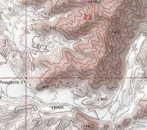
The above topo map shows the same general area we have been working with. Notice the shading or relief, which gives the map an almost 3D effect.
National Geographic and the USGS have teamed up to produce a new series of topographic maps. They have combined the historical USGS topo maps with all the original map features while adding the shaded relief map. We can now easily see the ridges and valleys.

Each 7.5 minute quadrangle comes as a free five sheet download The index map as shown above and the four larger sections. Each of the four can be printed at true scale and taken into the field. Now you can make accurate measurements. Which brings us to horizontal map scale.
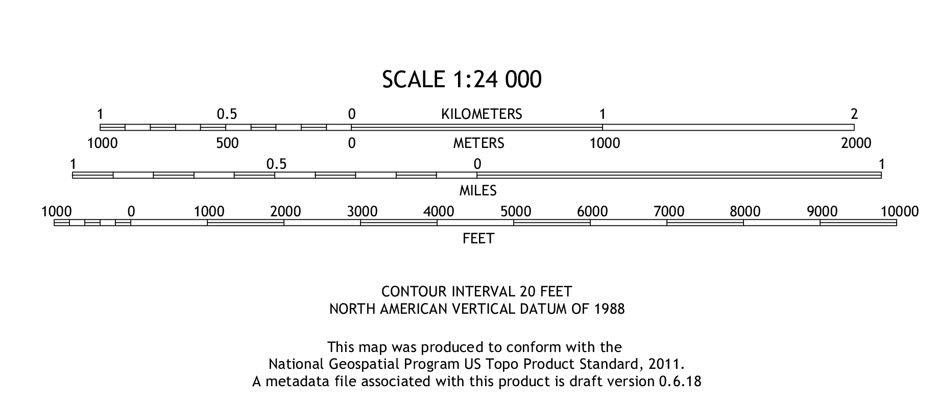
Topographic map horizontal scale
If you are using paper topographic maps in the field you’re going to need a way to measure approximate distances. The two most common horizontal map scales are 1:24,000, (7.5 minute), 1 inch equals 2000 feet, and 1:48,000 (15 minute) 1 inch equals 4000 feet. You can make your own scale by transferring the graphic scale (usually in the bottom center map border) to a piece of paper for use as a makeshift scale. Or, you can get an engineer’s scale that has 20 and 40 scale graduations. Each graduation on the scale would become 100 feet instead of one.
Map Scales
Just divide the map scale by 12 to find feet per inch
- 24000 divided by 12 = 2000 ft/in
- 48000 divided by 12 = 4000 ft/in
- 60000 divided by 12 = 5000 ft/in
- 72000 divided by 12 = 6000 ft/in
And so on and so forth.